Introduction:
Ding is an international mobile top-up service, allowing people to send phone credit to any number anywhere in the world.
In 2021 Ding wanted to introduce a Refer A Friend (RAF) programme. This feature would sit in the existing Ding.com website and required a UI for both the RAF sender and receiver (the ‘friend’).
The RAF programme was trialed in 2017 (prior to my joining Ding) but had low engagement. In 2021, the idea was resurrected and I was tasked with designing a simple, clear UI for both sender and receiver.
I approached the project in 3 phases: 1. Analyse, 2. Rethink and 3. Visuals.
1. Analyse:
I examined the RAF programmes of other brands. I also examined Ding’s previous RAF project. I then created wireframes and ran online user tests, exploring how best to structure the user experience.
2. Rethink:
Sender-side UI
Problem:
The original 2017 RAF experience had low customer uptake, partially due to the many steps required to take part in the programme.
Solution:
Avoid overloading the sender with instructions and keep things as simple and clear as possible.
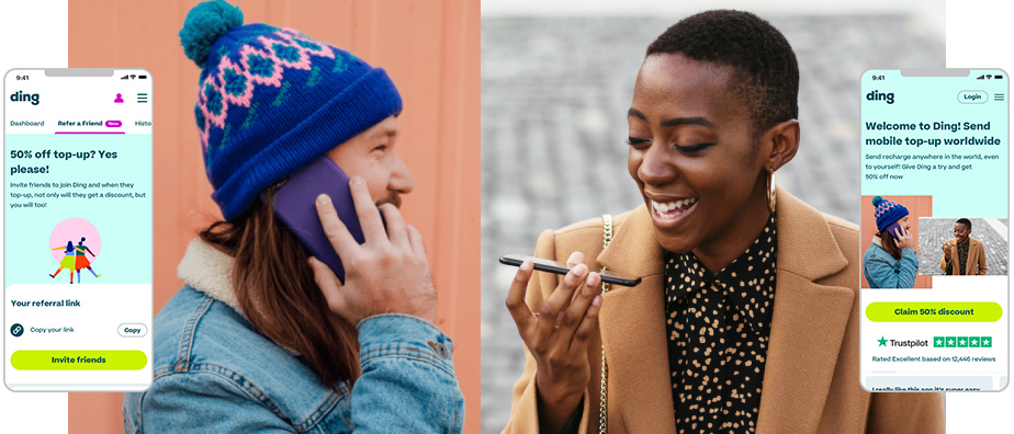
Receiver-side UI:
Problem:
Another issue with the 2017 RAF programme was low engagement on the receiver’s end. A key cause of this was the receiver’s unfamiliarity with the Ding brand.
Solution:
I designed a landing page that had multiple purposes:
1) Clearly and concisely explain who Ding is
2) Highlight our trustworthiness
3) Display the 50% off promotion.
3. Visuals
Sender-side UI:
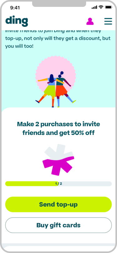

The sender is already familiar with Ding. The RAF sits in their Account section.
Customers need to make 2 purchases with Ding prior to ‘unlocking’ the RAF feature (as a way of reducing fraudulent activity). I represented this with the Ding asterisk symbol ‘filling up’ with each purchase.
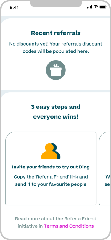
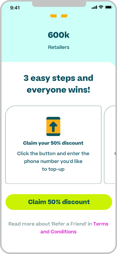
Explaining how the RAF scheme works required a lot of copy. To save on page real estate, I spread it across a carousel below the fold.
I chose colours from the Ding brand guidelines and used our regular fonts. I ran accessibility tests on colour contrasts, font size legibility, etc.
I used Ding’s ‘matcha’ colour for the primary CTA (“Invite friends”), and white with ‘spruce’ outline for secondary CTAs.
Receiver-side UI:

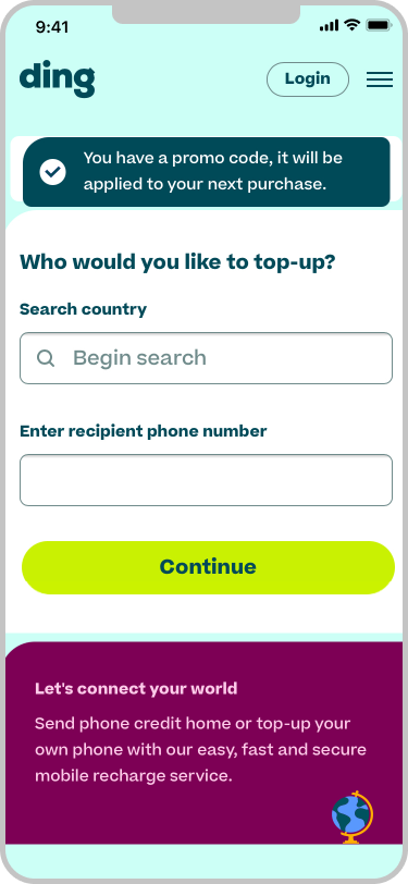
Online user testing responded better to photography than illustration here.
I kept it to 1 primary CTA to make the experience as simple as possible.
The receiver may not have heard of Ding before, so it was vital to highlight our trustworthiness. I included Ding’s Trustpilot score above the fold (and directly under the CTA). I also included user reviews.
On clicking the the ‘Claim…’ CTA, the customer is brought into the purchasing flow.